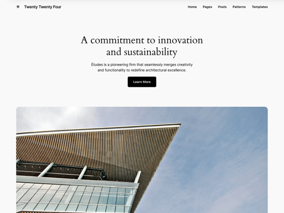
Today I changed the WordPress theme of this website.
After almost 4 years using The Independent Publisher theme, I finally decided to embrace WordPress FSE with the standard Twenty Twenty Four vanilla theme.
I’m surprised how easy it was to migrate from a non-block theme to a full block based theme. Maybe because my website is too simple. It has one page template for the home page, one for other pages and another for posts pages.
So I’ve made the move in a little less than 1 hour before dinner.
Responsiveness is much better now and the navbar even swaps into a hamburger menu. Neat.
I’ve got rid of a handful of plugins that turned redundant after the migration. I liked that because it ends up reducing the website’s surface for external attacks.
The original background color was FFFFFFull white. Now it’s F9F9F9, kinda icy.
The Posts page got revamped by the theme’s out of the box design settings. I like it much better now.
Overall, I’ve got a good feeling about this. The side is simpler, easier to tweak and to upgrade. It’s ready for the next 5 or 10 years maybe.
updates
202404 – yikes, the “icy” background color made some pages with images and drawings look odd.. like this one

